Carl Kleiner is back with a new set of colorful "paperscapes"
If you have used an Android device, you’ve probably seen Carl Kleiner’s abstract wallpapers on your home screen. What you may not have realized, though, is that his compositions are not digitally made; they are painstakingly designed and crafted photographs. Through lighting, layering, and considered color blocking, Kleiner’s work echos some of the early material studies we created while we were developing Material Design, particularly our process for developing iconography and emphasizing natural shadows and realistic depth with three-dimensional objects.

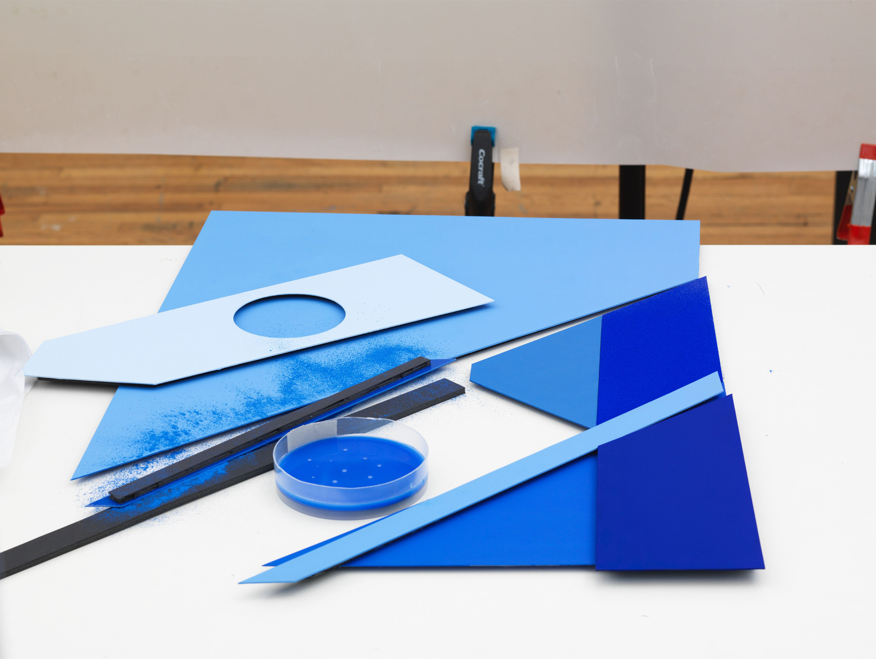
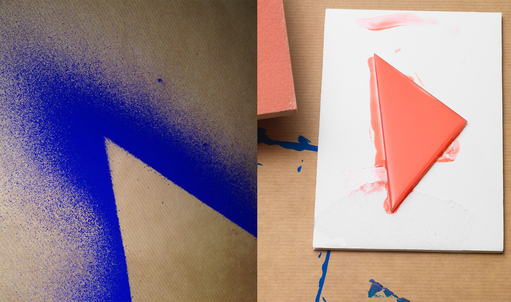
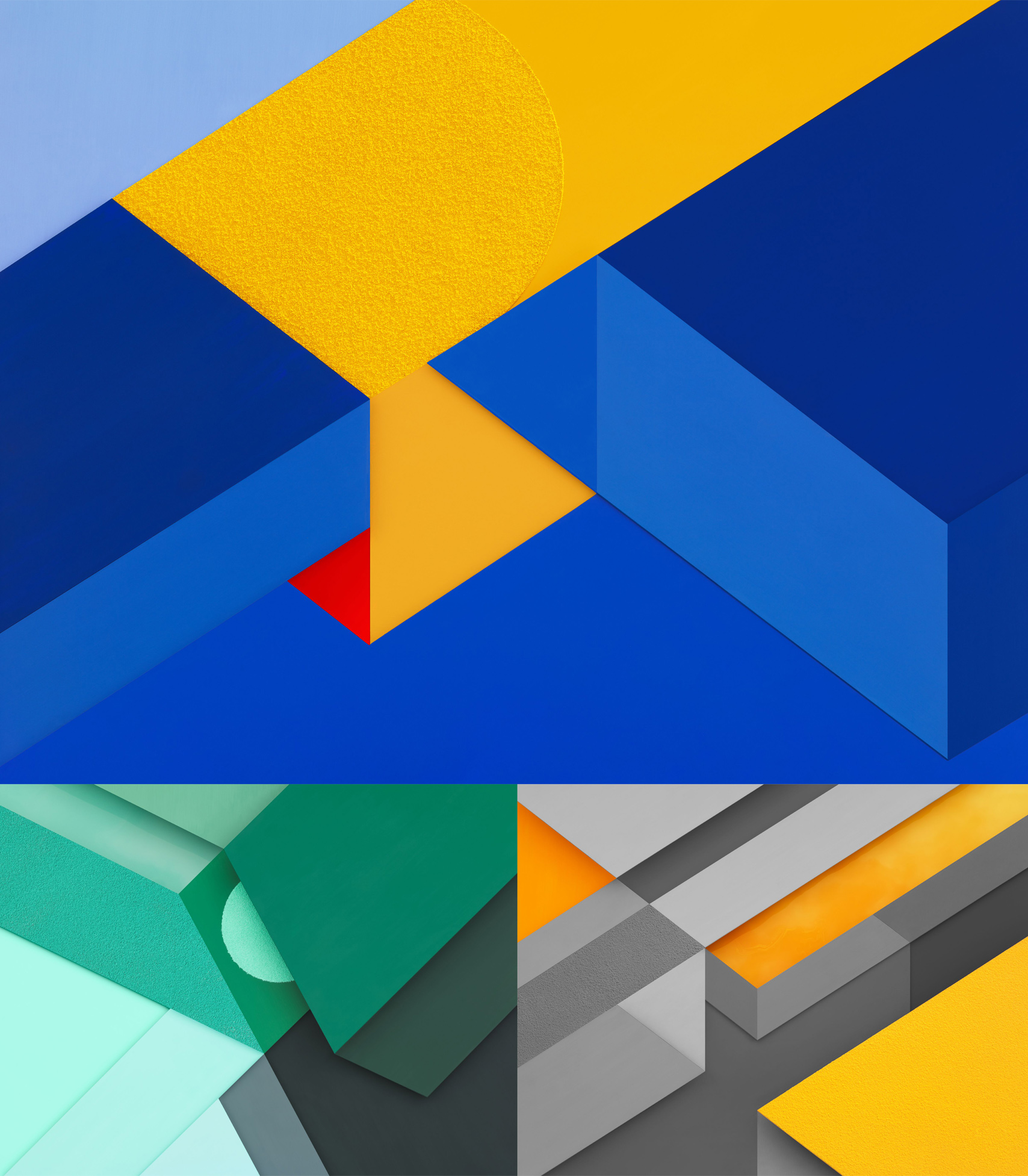
For the introduction of Material Design, we commissioned Kleiner to create three pieces called “paperscapes.” The pieces were constructed out of multiple paper-types, and were released with the Material Design guidelines as well as for the hero image and photographic set for Lollipop and various marketing collateral. This year, we commissioned Kleiner to create a new set for Android Marshmallow, which launched to the public on October 5th. The Marshmallow set plays up subtle shifts in tone and texture instead of relying primarily on bold color shifts. As Kleiner describes it, “We wanted to work with surfaces that have a subtle and sophisticated texture,” Kleiner says, “organic to the touch and graphic in composition…Painted surfaces, color pigment powders, floating ink and the like.”


Three wallpapers that launched as part of the Android Marshmallow's default set.

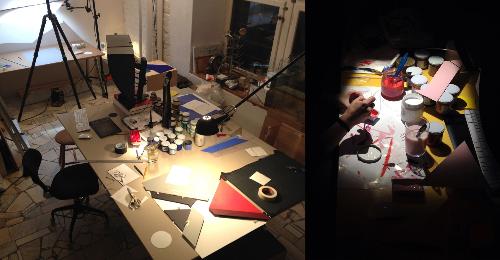
Behind the scenes in Carl Kleiner’s studio in Stockholm, Sweden.
We limited the palette to the core Google brand colors with pops of neutral gray. Kleiner maintained the mathematical precision of the original paperscapes, but decreased the scale, making the geometry slightly more complex. We added dimensionality and depth by using materials like colored water to create troughs, and grainy powders to suggest pixelation.
To create a robust and thoughtful visual language, imagery needs to be considered as thoughtfully as the graphic UX elements. This allows users to intuitively understand our products and know that they are in a space that has been thought through down to every last detail. Kleiner’s abstract photographs share the spirit of the Material Design system, while adding a new dimension of interest by drawing from different artistic disciplines and artfully blur the boundaries between illustration, photography, and design with his unique visual style.
